Components
Storybook
Through the storybook you can visualize and navigate around the features of the raaghu. Snippets for the elements allow you to test and design your UI faster and efficiently.
You can further customize and extend Storybook to suite your project's needs. The .storybook directory will contain configuration files, and you can customize Storybook's appearance, add addons, and more.
In Storybook, components are often organized into "stories" to showcase their different states, variations, and use cases. Storybook provides a way to visually document and test your components in isolation. Button elements are a common example for creating stories in Storybook.
create the stories file for perticular elements uisng filename.stories. storybook provide by default code in file creation.
import React from 'react';
import { Story, Meta } from '@storybook/react';

import MyComponent from './MyComponent'; // Import your component

export default {
  title: 'MyComponent',
  component: MyComponent,
} as Meta;

const Template: Story = (args) => <MyComponent {...args} />;

export const Default = Template.bind({});
Default.args = {
  // Add default props here
};
So take the example as button element. create the button.stories file.
Replace MyComponent with the actual name of your component. This example assumes your component is named MyComponent.
Run Storybook, and you should see your component story in the Storybook UI.
Add more stories as needed for other components in your project.
That's it! You now have a Storybook set up with React and TypeScript, and you can use it to document and showcase your components. Make sure to customize the Storybook configurations and your
Those are the control and action passing thoeugh the argTypes, here is example for button element.
export default {
    title: "Elements/Button",
    component: RdsButton,
    argTypes: {
        colorVariant: {
            options: [
                "primary",
                "secondary",
                "success",
                "info",
                "warning",
                "danger",
                "dark",
                "light",
            ],
            control: { type: "select" },
        },
        size: {
            options: ["small", "medium", "large"],
            control: { type: "select" },
        },
        tooltipPlacement: {
            options: ["top", "bottom", "right", "left"],
            control: { type: "radio" },
            if: { arg: 'tooltip' }
        },
    },
} as ComponentMeta<typeof RdsButton>;

const Template: ComponentStory<typeof RdsButton> = (args) => (
    <RdsButton {...args} />
);
create the multiple stoires for button elements.
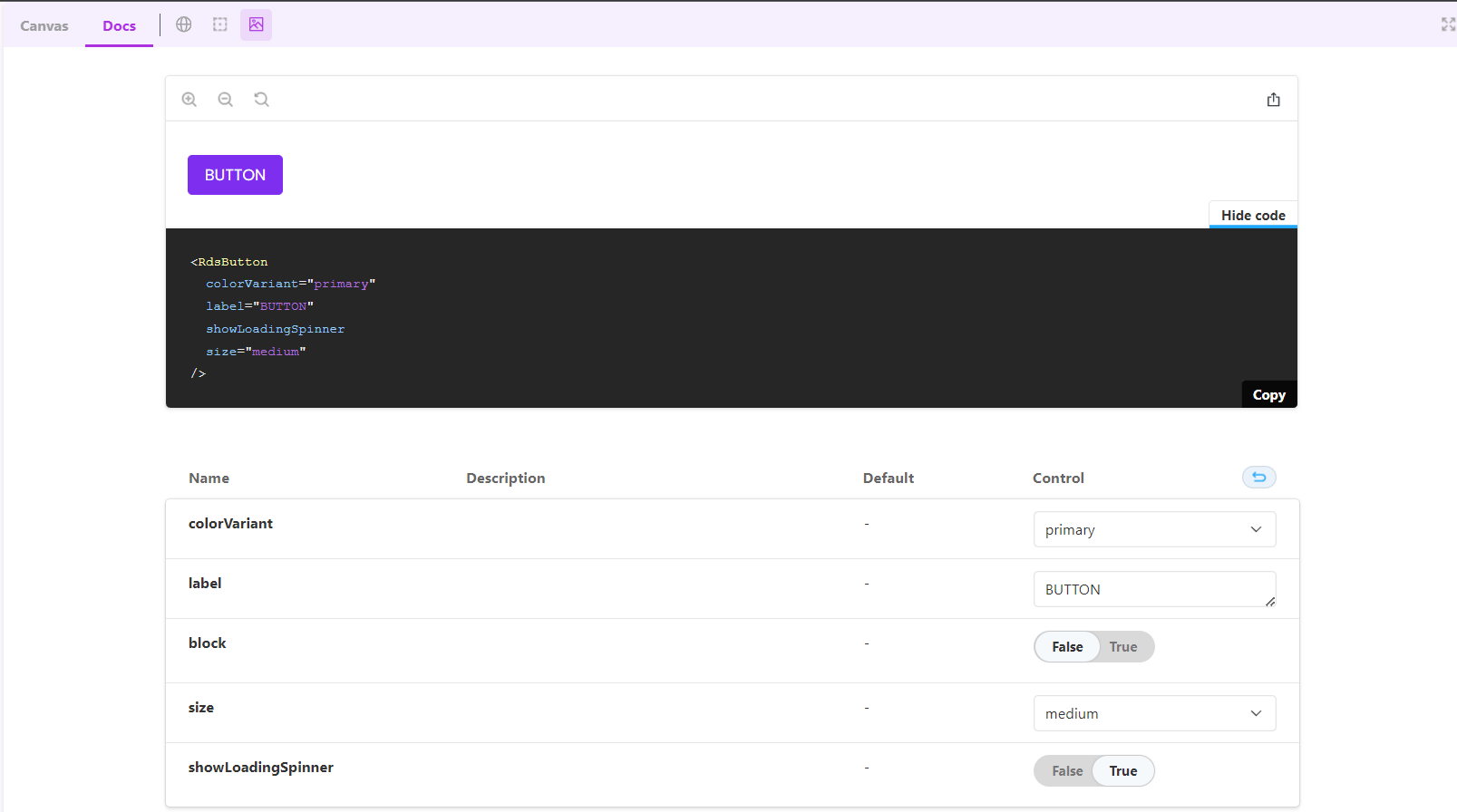
Default state of button shoing in below
export const Default = Template.bind({});
Default.args = {
    colorVariant: "primary",
    label: "BUTTON",
    block: false,
    size: "medium",
    showLoadingSpinner:true,
};
Disbaled state of button shoing in below
export const Disable = Template.bind({});
Disable.args = {
    colorVariant: "primary",
    label: "Disable",
    isDisabled: true,
    block: false,
    size: "medium",
};
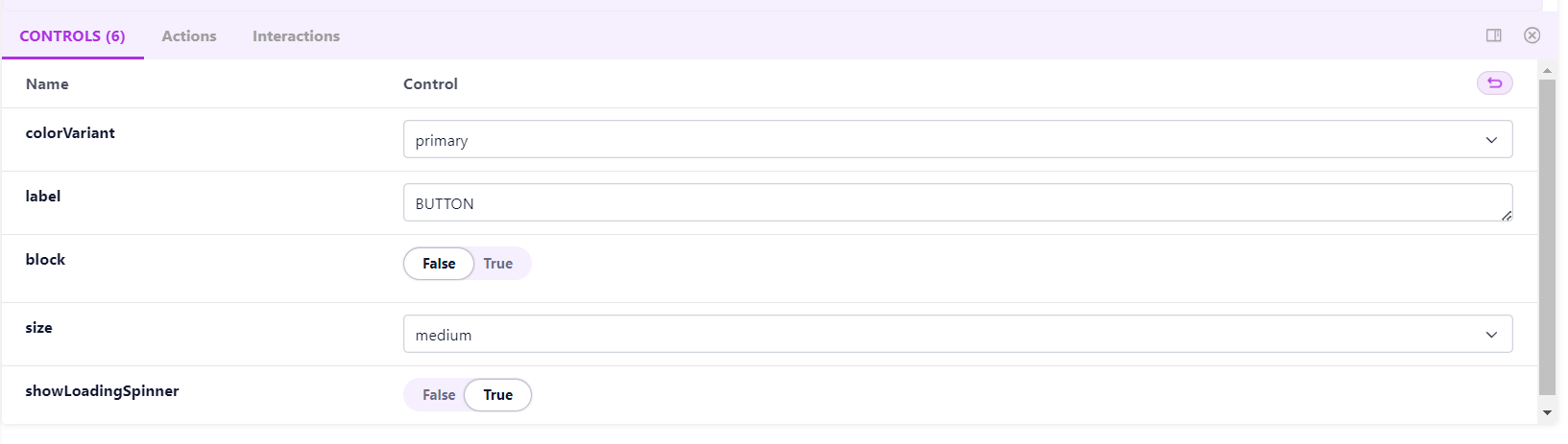
Control
Control allows you to tweak and customize the properties or props of a component in Storybook without modifying the source code. For a button component, you can use controls to change its text, color, size, and other relevant properties. This is particularly helpful for testing different configurations and states of your components.
There is control pannel in storybook UI. It will show the multiple control.
DOCS
Documentation in Storybook is often generated using addons like @storybook/addon-docs. It allows you to write documentation for your components directly within your story files using a combination of Markdown and TSX. This documentation can be accessed from the Storybook interface, making it easier for developers to understand how to use your components.